it's time
Hey all- it's been a while (again) and life has been plugging along. But you haven't missed anything- I SWEAR!
The new house is going to start in two weeks- yup, TWO WEEKS! Wow. That is just crazy- but it's time. We are out of our current home July 21, so we have 5 months and change to get 'er done. And that means, I actually have to start picking stuff out. It's exciting and scary and overwhelming. I get to do this one time- so I have to do it right. Yeah, I'm not putting any pressure on myself. Not at all.
via GIPHY
Today I'm going to start, where I'm going to have to start- outside.
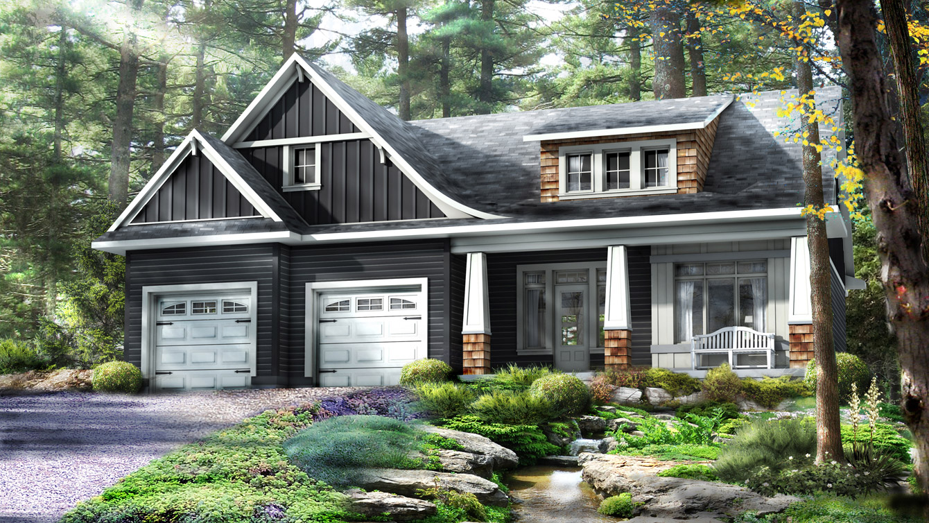
Here's the plan our house is inspired by
source
I love the feeling of this- but we aren't going to be in the woods, we are in a neighbourhood and we have to remember that when we do the exterior.
Also, this house has quite a craftsman vibe- not farmhouse like I'm used to. So strong, clean lines, contrasting trim- nothing ornate, or precious- not that I'm a fancy gal right now.
via GIPHY
We've been driving slowly by houses- being weirdos- and gawking at siding, trim, windows and doors. All things I've never looked at individually before. I've always just looked at the overall and thought "Nice house!" or "Nope"
I've also been cruising Pinterest and Houzz to get ideas (click on the links if you want to take a peak at my madness) We don't have it down to "the choice" yet but I've got it narrowed down.
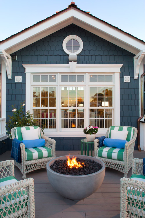
It's really no shock that I'm leaning towards blue or grey- but what shade, what kind of siding, oh the choices are endless!
I am totally digging the colour and the texture of the shakes in this house. (But no scallops. I like those best sauteed in butter) Wide white trim like this is also on our list.


The new house is going to start in two weeks- yup, TWO WEEKS! Wow. That is just crazy- but it's time. We are out of our current home July 21, so we have 5 months and change to get 'er done. And that means, I actually have to start picking stuff out. It's exciting and scary and overwhelming. I get to do this one time- so I have to do it right. Yeah, I'm not putting any pressure on myself. Not at all.
via GIPHY
Today I'm going to start, where I'm going to have to start- outside.
Here's the plan our house is inspired by

source
I love the feeling of this- but we aren't going to be in the woods, we are in a neighbourhood and we have to remember that when we do the exterior.
Also, this house has quite a craftsman vibe- not farmhouse like I'm used to. So strong, clean lines, contrasting trim- nothing ornate, or precious- not that I'm a fancy gal right now.
via GIPHY
We've been driving slowly by houses- being weirdos- and gawking at siding, trim, windows and doors. All things I've never looked at individually before. I've always just looked at the overall and thought "Nice house!" or "Nope"
I've also been cruising Pinterest and Houzz to get ideas (click on the links if you want to take a peak at my madness) We don't have it down to "the choice" yet but I've got it narrowed down.
It's really no shock that I'm leaning towards blue or grey- but what shade, what kind of siding, oh the choices are endless!
I am totally digging the colour and the texture of the shakes in this house. (But no scallops. I like those best sauteed in butter) Wide white trim like this is also on our list.
I love this grey, the shakes, the garage door.

Oh Joanna Gaines- you get me. Every. Single. Time. (the kitchen in this house is a big inspo too)
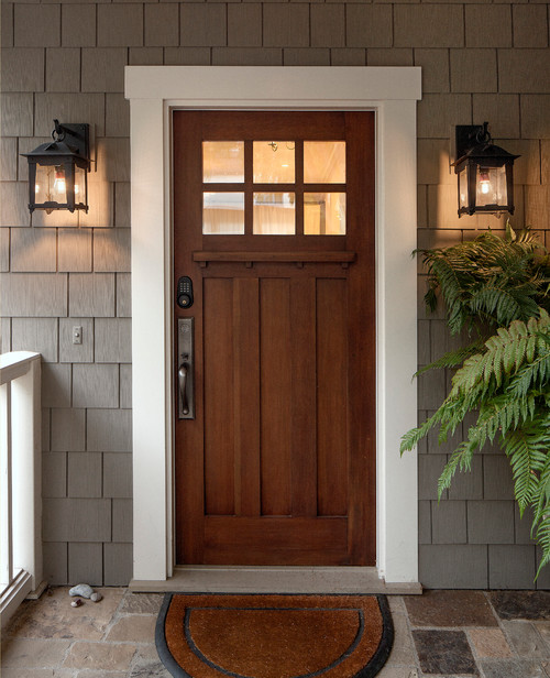
I love this entrance. The colour, the door, lanterns. All this.
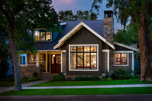
I love the black framed windows- but I don't know if I love them 30% more. But I love them. The white capping on the sides of the house- that's a Tim thing. I really like the bigger shake accents with the horizontal siding. It gives the house and makes it pop.
Photo by Karl Neumann Photography - Discover craftsman exterior design ideas
source
This softer grey with black and aqua accents caught my eye too.

source
While we might not have our minds made up with the siding choices- the door.
I got that one down.
I thought I had wanted a painted door, until we went to the show room and looked a something very similar to this in person and I fell in love with it. It's strong, simple and classic. AND I don't have to paint it- as door painting seems to be quite the swear word filled debacle around here.
source
This softer grey with black and aqua accents caught my eye too.

source
While we might not have our minds made up with the siding choices- the door.
I got that one down.
I thought I had wanted a painted door, until we went to the show room and looked a something very similar to this in person and I fell in love with it. It's strong, simple and classic. AND I don't have to paint it- as door painting seems to be quite the swear word filled debacle around here.
Photo by DLG Lighting Co - Search craftsman exterior pictures
source
I know, it's about as clear as mud, but that's my process right now. A little haywire- but I'll get there. In the meantime, I've set up an Instagram account so you can see the progress. Now that we're off and running, I'll be documenting a whole lot more. I hope you follow along- and I hope I don't lose my mind, what's left of it anyways.
Comments
Franklin Stewart @ Muller Exteriors